To make sure to get your point across visual communication is essential. The power of an image goes a long way. Like words, visuals often carry connotative or symbolic meanings. Some good tips for visual design are following these principles: (pg.344)
· Consistency: you can achieve visual parallelism in a variety of ways, including through consistent use of color, shape, size. Texture, position, scale, or type face.
· Contrast: to highlight the different ideas, illustrate objects in contrasting colors, shapes, or sizes.
· Balance: it can go two ways, formal or informal. Formal is where the elements of the images are fixed to fit symmetrically around a single point. Informal is where the elements don’t tribute evenly. However, it can show the differences between stronger objects and weaker ones with different sizes.
· Emphasis: to demonstrate your most important information using bright colors to catch people attention. Make it the most dominant element in your representation.
· Convention: just as written communication visual communication is guided by an array of spelling, grammar, punctuation, and usage conventions.
· Simplicity: as a general rule, simple is better. Even when it comes to visuals for business communication. Too much of anything will lose your audience. Simple and to the point is always great to get your message across.
Verbal
Information Retained
Studies show that people remember
· 10% of what they hear and
· 20% of what they read, but about
· 80 percent of what they see and do
Verbal + Visual
Information Retained
Studies show that people remember:
· 10% of what they hear
· 20% of what they read
· 80% of what they see and do
Knowing what visual design to use is crucial. Here are some ideals.
v To present individual exact values
Ø Table
Example:

v To show trends in one or more objects, or the relationship between them, over time
Ø Line chart
Example:

v To compare two or more sets of data
Ø Bar chart
Example:

v To show frequency or distribution of parts in a whole
Ø Pie chart
Example:


v To compare entities against two or three variables
Ø Scatter charts, bubble charts
Example: Scatter chart


Bubble chart


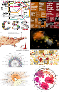
v To show massive data sets, complex quantities, or dynamic data
Ø Data visualization
Example:
And


And

Always remember that your visual must show what you are trying to say.
No comments:
Post a Comment